Home • People • Courses • Program • Research • Clinic • Goals • Kiosk • News
Understanding Basic Statistics • Fitting • Exercise • Excel • Igor • Kaleidagraph • Origin • Power Laws • Dimensional Analysis
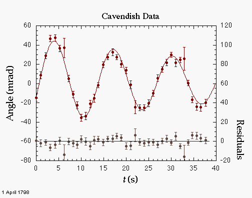
To learn how to make a graph such as the one shown above, follow the discussion below the graph. Click on a feature of the graph, or the text links beneath it, to jump to the instructions for that feature.
Origin is a convenient data analysis and graphics program that runs in Windows on PCs. You can use Origin to plot data, transform raw data to more meaningful quantities through column-based calculations, compare data to a theoretical model using linear and nonlinear least-squares fitting, and determine the quantitative agreement between the data and model.
You may type data directly into a data sheet or import data from the clipboard, from a text file, from an Excel data sheet, or from a large variety of other file formats. The action starts in the File|Import menu item, and you can learn about various file formats in the online help. Instructions for importing common kinds of data follow here.
Bear in mind this important point: the basic unit of data is the column. In Origin, a column may be designated to represent X values, Y values, Z values, X error bars, Y error bars, or labels. By default, the first column is called A(X), the second is B(Y), and additional columns may be added using Column|Add New Columns... You can set the function of a column using the column box obtained by double-clicking on the column head, or with the pop-up menu obtained by right-clicking on the column head.
If the data exist in some other program, copy them to the clipboard, switch to Origin, select the upper left corner of the region of a data sheet into which you wish to place the data, and paste. If the data are not tab-delimited (e.g., comma separated values), this method does not work. Save the data in a text file and proceed with the following, instead.
For simple files, you can use the File|Open command to access the text file. Select the kind of file from the popup menu, then pick the file. If Origin's default options for parsing the text file don't work, try the File|Import command and provide more information about the structure of your data file.
Origin 7.5 can work with data from Excel without having to import it into an Origin worksheet. Just open the Excel file with File|Open Excel.... On the other hand, performance may be better if you import the data. Just use copy and paste.
You can enter values into a column using a formula based on another column.
?
Residuals are the difference between the actual data points and the fitted line or curve. To compute residuals, you must first perform the fit. In version 3.5 or higher, you then select the same fit function from the fitting menu to bring up the fit dialog, which will now contain a popup View menu of options. Select Paste Residuals to Data Window... A column is appended to the data sheet linked to the graph, and given the title Residuals. (A new column is always generated, even if you already have a column called Residuals.)
To produce a panel of residuals on the graph, you must use the Double Y style. If you already have the graph made using another style, bring it to the front, go back to the Gallery menu and select Double Y and put the column of residuals on the Y2 axis. Then click to Replot the graph. Unfortunately, you have to fix up all the error bars again.
A data set is placed in a single column. Each Y column is associated with the nearest X column to its left. These associations are indicated by affixing a number after the Y in the column heading. For example, a column marked Y2 is associated with the X2 column. In each layer, you can have multiple X columns and multiple Y columns. Unless you specify otherwise, a Y column will be automatically graphed against its associated X column. In addition, you can have a x and y error columns for each X or Y data set. Note that version 5 allows you to plotted data from more than one data sheet on a plot.
Once you have entered your data, do the following to create a graph:
The procedure outlined above only works if all your columns are contiguous. If they are not, the following alternate procedure is necessary. Please note that all data sets that form a single data plot must be on the same worksheet.
If you want to change the size of the layer, do it before adding any labels, so that you can pick a font size that fits the graph. There are two ways to adjust the size the layer or move it around on the page. The first is:
The other is:
By default, Origin will put a frame around the plot area only if you plot the scatter type. If you made some other type of graph, you will need to add one. Here's how:
By default, Origin adjusts the range of each axis automatically. You can override its choice as follows:
Data points should be plotted as individual points with a symbol size that makes sense for the number of data points in the plot and the plot size. There should not be a line connecting successive points. Points should be shown with error bars, if available.
The easiest way to put error bars on a plot is to "bless" the appropriate column(s) of errors before creating the plot. You can bless the column by right-clicking in the column head and using the Set As... command. Alternatively, you can add one or more error bar columns to a data set after the graph is made using the Plot | Add Error Bars... command.
If the positive-going error bar differs from the negative-going one, you need to have two error bar columns in your data sheet. Bless both of them as y error bars, as described in the previous section. Then make the plot. (Or add one or more error bar columns to an existing graph.) You will see two overlapping sets of error bars on your data series.
Now double-click on the error bar for a data point on the graph. A dialog opens that shows the name of the error bar column and has (among other items) check boxes positive and negative. Uncheck one or the other. Then repeat this for the second error bar on a data point.
Adding a function graphFunction graphs are exactly what their name implies: graphs of functions you specify. They are most useful for adding a theoretical curve to a plot of experimental data. The only restriction on the types of graphs is that y must be an explicit function ofx which can be represented using Origin's built-in functions. They can be added as follows:
You may add additional text labels using the text tool ("T" inthe Toolbox) and add lines, with or without arrows, with the line tool. Labels you don't want can be deleted by selecting them and pressing Del. In any text editing box, there are several buttons which can be used to embellish your text:
These may be used in one of two ways. One is to select text already written and then click on the button. The other is to click the button, type your text, and then end the effect by either clicking on Normal or pressing Right-Arrow.
These are some of the most important Greek letters:
| Alpha: a. | Beta: b. | Gamma: g. | Delta: d. | Epsilon: e. | Mu: m. | Chi: c. |
| Theta: q | Phi: f. | Pi: p. | Nu: n. | Lamba: l. | Omega: w. | Psi: y. |
The method described below makes use of Origin's built in linear regression tool. This has the advantages of being quick and easy, but has the disadvantage of ignoring the uncertainties (errors) in your data. It does not calculate a meaningful χ2, so you cannot readily determine how confident you can be of the fit. In general, you should define an appropriate fitting function, as described in Fitting to an Arbitrary Curve.
The result will appear in the Script Window. You will need to enlarge the window and scroll up several lines in order to see it. To enlarge a window in Windows, click on the lower right-hand corner and drag it to the new size. You can cut and paste the results from there into a text label on the plot as follows:
The arbitrary curve fitter (called NLSF for Nonlinear Least-Squares Fitter) in Origin is both powerful and complex. Consult the Origin manual for a complete description of its capabilities. The following section will simply provide a tutorial for basic operation.
Warning: unless you set the options correctly, Origin 5 will NOT use your uncertainties, even though they appear on the graph, and will give incorrect values for χ2 and the uncertainties in the fit parameters. Follow the instructions below carefully to be sure Origin does your fit correctly.
The example will be a linear fit function of the form y = mx+ b. This function has two free parameters, namely m andb.
Nonlinear curve fitting is a tricky business. Most often its success rides on choosing initial guesses for the parameters that are close to the best-fit values. If they are too far away, the process may get stuck in a local minimum, unable to find the best fit.
There are four main possibilities that arise when Origin gives you an error message while during LM.
If Origin never settles on stable values of the parameters, then you probably have too many. Try either eliminating some of them or prevent them from being varied by clicking on the Vary? check box in the Fit window.
For use in a lab notebook, it is very convenient to print a version of your graph that is small enough to permit you to annotate the graph and explain its significance on the same notebook page. A graph with a plot area of about 4 inches by 3 inches is quite good for this.
Left to its own devices, Origin will fill the entire page. This is usually bigger than you want. To shrink it down, click on the lower right corner of the plot area until you get a square drag handle. Resize the plot area until it is the size you want. Even better, you can double-click the gray square at the top left corner of the plot window and enter the size you wish directly.
Written by Itai Seggev and Peter N. Saeta.
Understanding Basic Statistics • Fitting • Exercise • Excel • Igor • Kaleidagraph • Origin • Power Laws • Dimensional Analysis|
|
Copyright ©
Harvey Mudd College Physics Department 241 Platt Blvd., Claremont, CA 91711 909-621-8024 http://www.physics.hmc.edu/ WebMaster (at) physics.hmc.edu Last modified: 05 January 2010 |