Origin is a convenient data analysis and graphics program that runs in Windows on PCs. You can use Origin to plot data, transform raw data to more meaningful quantities through column-based calculations, compare data to a theoretical model using linear and nonlinear
least-squares fitting, and determine the quantitative agreement between the data
and model.
These instructions apply to version 4.0, which is available on the HMC
server. Version 3.5 is also available on the server, and differs from 4.0
in several aspects of the user interface. See the documentation on Origin 3.5 for more information.
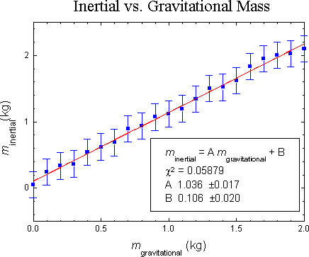
A sample graph is shown below. Click on an aspect of the graph to learn how
to adjust or produce that element in Origin. Beneath the graph is a table
of contents of all the topics covered on this page.
This section explains the basic philosphy of Origin, and ends with abrief glossary of
the most important Origin terms. The rest of thedocumentation will explain specific
Origin features and will make useof Origin terminology.
Origin is built around Windows' Multiple
Document Interface (MDI). MDI is a technical standard which allows a single
program to create "childwindows" with in its "work area" (the work area is
the entire area within the window of an application below its pull-down menu).
Each window can be moved and resized independently. Each of Origin's five types of
child windows has its own menu structure. The menu visible onscreen will
correspond to the type of the active window. To change the active window, you can
click on a window to activate it, or you can press Control-Tab to cycle
through all open windows. All the windows open on screen constitute a "project,"
which can be saved and reopened as a unit. If you close a window (as opposed to
minimzing it), whatever was in that window is destroyed.
The types of child windows are worksheet, graph, function graph, page
layout, and matrix. The primary emphasis of this page is on worksheet and
graph windows, as they are of the most interest when plotting real world
data. A worksheet is similar to a spreadsheet, and is used for holding
data. A graph represents a single logical page and all the plots (called
"layers" in Origin) which are on it. A function graph is used to plot
mathematical functions. A page layout window, though not covered on this
page (maybe in the next version...), is useful as it allows you print
different worksheets and graphs on a single piece of paper. A matrix can
be used to compute various matrix operations; it is not discussed on this
page and is mentioned only for completeness.
Import ... command
to read the data into an Origin worksheet. If they are available in another
program whose fileformat is not supported, most programs will allow you to
export the file as tab-delimited ASCII (or other ASCII formats) which you
can import. For Excel or other Windows programs, you can also use cut-and-paste
between them.
Type your data in columns noting the following points:
- Return advances the cursor down the column.
- Tab advances the cursor to the right.
- Arrow keys move move the cursor in their respective directions.
- If an area of the worksheet is selected Shift + Mouse will add to the selected
area rather than creating a new one. However, you can only select contiguous,
rectangular areas in Origin.
- Once more than one cell is selected, there is no longer an activecell. You must
click on a single cell before you can use the arrow keys or edit data.
- Double click on the column heading to rename the column and set other options.
Column names in Origin can be up to 11 characters long and include letters, numbers,
and a period.
You can also paste regularly shaped blocks from any Windows
spreadsheet into Origin.
- Go into your spreadsheet and select your data.
- Select Edit|Copy or press Control-C.
- Press Alt-Tab until you reach Origin.
- Click on the upper left hand corner of where you want to paste the block.
- Select Edit|Paste or press Control-V.
Origin can directly import data from the
following binary formats: Excel, Lotus 1-2-3, DBase, and DIF. To import,
selectImport|Format-Name.
Use the File|Import|ASCII
command to access text files. Many different file configurations can be handled
by setting appropriate file import options. For example, to import a
tab-delimited text file, do the following:
- Select File|Import|ASCII Options
- From the Delimeted, Delimeter pop-up menu choose Tab
- Click on Import Now
- Select the file and click on OK.
You can enter values into a column using a formula based on another column.
- Select
the column into which you want to enter the results by clicking on the column name.
- Choose Data|Set Column Values
- Enter the formula you want to use in the text box. Useful functions include:
- col(x): returns the value in column x. Note: x is the name of the column.
- log(x): common log of x.
- x^y: x raised to the y power.
- sin(x), cos(x), tan(x): your everyday trig functions.
- asin(x), acos(x), atan(x):inverse trig functions.
- NOTE: all trig functions work in radians by default.
- Set the rows for which you want this formula to apply (upper right-hand corner).
- Click on Do It.
A data set is placed in a single column. Each Y column is associated with the
nearest X column to its left. These associations are indicated by affixing a
number after the Y in the column heading. For example, a column marked Y2
is associated with the X2 column. In each layer, you can have multiple X
columns and multiple Y columns. Unless you specify otherwise, a Y column
will be automatically graphed against its associated X column. In addition,
you can have a x and y error columns for each X or Y data set. Once you have
entered your data, do the following to create a graph:
- Select the column holding the x data.
- Choose Column|Set as X.
- In place of the previous two steps, you can double click on the
column heading a select X from the Set Column As pop up menu.
- If you have a (several) column(s) of errors:
- Select the column(s).
- Choose the command Column|Set as Error Bars (or choose Err Bars
after double clicking on the column heading.)
- For x error column, you will need to also choose Column|Error Bar Options
and click on X error bar.
- Select the x, y, and errors columns.
- Choose the command Plot|Scatter.
- It may be useful at this point to expand the window by clicking the up arrow at
the right of the title bar.
The procedure outlined above only works if all your columns are contiguous.
If they are not, the following alternate procedure is necessary. Please
note that all data sets that form a single data plot must be on the same
worksheet.
- Without any columns selected, choose Plot|Scatter.
- Single click on the name of the column you want to hold the xdata.
- Click on the X button.
- Repeat this process for Y, yEr, and xEr.
- Click on the Add button.
- Repeat steps 2-5 for each y column. The x
columnsneed not be the same.
- If you want to
remove a dataplot from the list of dataplots to bemade , single click
on it and then click on the Remove button.
- Click on OK.
If you want to change the size of the layer, do it before adding any labels,
so that you can pick a font size that fits the graph. There are two ways to
adjust the size the layer or move it around on the page. The first is:
- Double click on the gray plot-layer button in the upper left-handcorner.
- Click on Layer Properties.
- Enter new values of the height, width, left, and top.
- Click on OK, then click on the new OK.
The other is:
- Single click on a corner of the axes. They should change color,and
eight control points should appear (one at each corner and the bisections of the
sides).
- To move the layer, click anywhere inside the axes a drag it to its
new location.
- To resize the layer, click on one of the control points and
drag to a new size. The control points in the corner can be used to adjust the
size both horizontally and vertically, while the control points at the bisections
can only change the size in the direction perpendicular to the side.
- When finished, single click anywhere outside the layer but still on the
page. The old plot will now disappear, and a new one will materialize within the
box.
By default, Origin will put a frame around the plot area only if you plot
the scatter type. If you made some other type of graph, you will need to add
one. Here's how:
- Bring up the x axis diaglog box by either double clickingon the axis
or choosing Format|Axes|X Axis
- Enable the following check
boxes
- Axis Top
- Top Axis In
(Major)
- (If you wish) Top Axis In
(Minor)
- Click the Goto Y button.
- Enable the following
check boxes by clicking on them.
- Axis
Right
- Right Axis In (Major)
- (If you wish)
Right Axis In (Minor)
- Click on OK
By default, Origin adjusts the range of each axis automatically. You canoverride its
choice as follows:
- Double
click on the x or y axis, or choose Format|Axes|X Axis or
Format|Axes|Y Axis
- Enter a new value for the lower bound.
- Press
Tab and enter a new value for the upper bound.
- You may want to adjust Increment, the distance between two
consecutive tick marks or enter the number of tick marks directly.
- If desired, click on Goto X or Goto Y and repeat this procedure.
- Click on OK when finished.
Data points should be plotted as individual points with a symbol size that makes
sensefor the number of data points in the plot and the plot size. There should
not be a line connecting successive points. Points should be shownwith
error bars, if available. Make a column of error bars on your data
sheet.
Turning off lines and/or modifying plot symbols
- By default, there should be no connecting lines.
- A dialog box for modifying the line and plot symbol can be brought up
by double clicking on a data point in the plot area or by double clicking
on the plot symbol in the legend.
- If you have several data series on the same graph, you will need to perform
the following:
- Double click on one of the data series to open the dialog box.
- Click on the Ungroup.
- Click on OK.
- If you have a theoretical curve, it should be a function graph and not a
normal data plot. However, its display(and other) properties can still be
modified by double clicking on it.
Function graphs are exactly what their name implies: graphs of functions you
specify. They are most useful for adding a theoretical curve to a plot of
experimental data. The only restriction on the types of graphs is that
y must be an explicit function ofx which can be represented
using Origin's built-in functions. They can be added as follows:
- Select Plot|Add Function Graph
- Enter the function in the edit area.
- Select other options as desired and click on OK
You may add additional text labels
using the text tool ("T" inthe Toolbox) and add lines, with or without
arrows, with the line tool. Labels you don't want can be deleted by selecting
them and pressingDel. In any text editing box, there are several buttons
which can be used to embellish your text:
- Bbold.
- I italic.
- + superscript.
- -subscript.
- U underline.
- GGreek
These may be used in one of two ways. One is to select text
already written and then click on the button. The other is to click the button,
type your text, and then end the effect by either clicking on Normal or
pressing Right-Arrow.
These are some of the most important Greek
letters:
| Alpha: a. |
Beta: b. |
Gamma: g. |
Delta: d. |
Epsilon: e. |
Mu: m. |
Chi: c. |
| Theta: q |
Phi: f. |
Pi: p. |
Nu: n. |
Lamba: l. |
Omega: w. |
Psi: y. |
The method described below makes use of
Origin's built in linear regression tool. This has the advantages of being quick
and easy, but has the disatvantage of ignoring the uncertainties (errors)
in your data. It does not calculate a meaningful c2, so you cannot
readily determine how confident you can be of the fit.
In general, you should define an appropriate fitting function, as
described in Fitting to an Arbitrary Curve.
- If the linear regression tool bar isn't visible, selectTools|Linear Fit.
- Make surethe data set you want to analyze is the active data set. You can do so by
selecting the Data. There will be anX next to the active data set.
If the data set is inactive, then click on it or press the underlined number to
its left.
- Click on the Settings tab.
- Make sure that the Span X
Axis box is checked.
- If desired, check the Residual Data box. This
will create a residuals column in the worksheet, which will make it easier
to calculate Chi2.
- Click on the Operation
tab.
- Check the the Error as Weight box.
- If desired, check the
Through Zero box. This forces the line to pass through the origin.
- Click on Fit
The result will appear in the Script
Window. You will need to enlarge the window and scroll up several lines in
order to see it. To enlarge a window in Windows, click on the lower
right-hand corner and drag it to the new size. in You can cut and paste the
results from there into a text label on the plot as follows:
- Make sure there is already a text label for the text to go to, or click on
T in the Toolbox to create a new one.
- Select the text with in the script window, and chooseEdit|Copy
or press Control-C.
- Double click on the text label to open it.
- Single click within the text edit area to de-select the
text. This prevents that text from being destroyed when you paste.
- Position the cursor where you want to insert the text.
- Select Edit|Paste orpress Control-V.
The arbitrary curve fitter (called NLSF for Nonlinear Least-Squares Fitter)
in Origin is both powerful and complex. Consult the
Origin manual for a complete description of its capabilities. The
following section will simply provide a tutorial for basic operation. The example
will be a linear fit function of the form y = mx+ b. This
function has two free parameters, namely m andb.
- Choose Analysis|Non-linear Curve Fit.
- Choose Function|New or click on the button with a whitepeace of
paper with just f(x) on it. When you quit
Origin, it will ask you if you want to save your new function. Choose Discard
All.
- Check the User-defined Names box.
- Click in the Parameter Names box (alternatively,
pressTab) and typem,b.
- Click in the large equation box at the bottom and type the
equation m*x+b. In general, you may use any of the functions listed above in defining your fit
function.
- Choose Action|Data set or click on the button with with
a matrix on it.
- In the Data sets box, single click on the data set you
want to be the y data and click on Assign.
- Choose
Options|Control or click on the button with a marionette on it.
- From Weighting Method, select Instrumental. This means
it will take into account your y-error column when doing the fit.
- Choose Action|Fit or click on the button with a green light on it.
- At this point, you will need to set initial values for the parameters.
Click in each box and enter the value you expect the parameter to be.
- Click on 10 Iter.. If the fit goes less than
a full ten rounds (the display will tell you how many rounds it completes)
then you're done. Otherwise, click on it again. If you receive an error
message or if the parameters never stop changing, see NumericalNote below.
- Click on Done!. The curve will be plotted, and the results
will appear in a text box on the plot.
- Double click on the text box, and
choose Black Line fromthe Show Background drop-down menu.
-
NOTE: the value of c2 is really c2
per degree of freedom.
Nonlinear curve fitting is a tricky business. Most often its success rides
on choosing initial guesses for the parameters that are close to the
best-fit values. If they are too far away, the process may get stuck in a
local minimum, unable to find the
best fit.
There are four main possibilities that arise when Origin gives you an error
message while during LM.
- The function was entered incorrectly. For example, "mx" insteadof
"m*x." Choose Function|Edit to correct the mistake.
- The original parameters given were so far from the
target the LM iterations headed in the wrong direction, eventually causing
numeric overflow. Try entering different starting values.
- The function being fit is discontinuous. This mainly occurs
with trigonometric functions. LM only works with differentiable functions.
You will need to change your data in such away as to make the function
continuous.
- The fitting involves either very large or very small numbers. The LM
method is overly gross in the changes it makes, and the function
heads of in the wrong direction. This can be corrected by
constraining the variables to certain ranges. Choose
Options|Constraints.
If Origin never settles in a one value of the parameters, then you probably
have too many. Try either eliminating some of them or prevent them from
being varied by clicking on the Vary? check box inthe Fit
window.
For use in a lab notebook, it is very convenient to print a version of
your graph that is small enough to permit you to annotate the graph and
explain its significance on the same notebook page. A graph with a plot
area of about 4 inches by 3 inches is quite good for this.
Left to its own devices, Origin will fill the entire page. This is
usually bigger than you want. To shrink it down, click on the lower right corner
of the plot area until you get a square drag handle. Resize the plot area
until it is the size you want. I do not know of a way to see numerically
how large the plot will be, nor a way to type the exact size you want in
directly. If you do, please tell me!
Written by Itai Seggev and "PNS".

|
Copyright © 2001 Harvey Mudd College Physics Department
http://www.physics.hmc.edu/
WebMaster@Physics.hmc.edu
This page was last modified on Tue, Jan 13, 1998.
|