Origin is a convenient data analysis and graphics program that runs in Windows on PCs. You can use Origin to plot data, transform raw data to more meaningful quantities through column-based calculations, compare data to a theoretical model using linear and nonlinear least-squares fitting, and determine the quantitative agreement between the data and model. Warning: when fitting data in Origin 5, unless you set the options correctly, the program will NOT use your uncertainties, even though they appear on the graph. It will give incorrect values for c2 and the uncertainties in the fit parameters. See below for details. These instructions apply to version 5.0, which is available on the HMC server. Version 3.5 is also available on the server, and differs from 5.0 in several aspects of the user interface. See the documentation on Origin 3.5 for more information.
A quick note on notational conventions in on this page: Text appearing in Bold generally denotes the literal text appearing onscreen. The notation A|B means select item B from menuA.
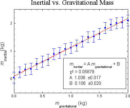
A sample graph is shown below. Click on an aspect of the graph to learn how to adjust or produce that element in Origin. Beneath the graph is a table of contents of all the topics covered on this page.
| |||||||||||||||
| Introduction and Glossary |
| ||||||||||||||
This section explains the basic philosphy of Origin, and ends with a brief glossary of the most important Origin terms. The rest of the documentation will explain specific Origin features and will make use of Origin terminology. Origin is built around Windows' Multiple Document Interface (MDI). MDI is a technical standard which allows a single program to create "child windows" with in its "work area" (the work area is the entire area within the window of an application below its pull-down menu). Each window can be moved and resized independently. Each of Origin's five types of child windows has its own menu structure. The menu visible onscreen will correspond to the type of the active window. To change the active window, you can click on a window to activate it, or you can press Control-Tab to cycle through all open windows. All the windows open on screen constitute a "project," which can be saved and reopened as a unit. If you close a window (as opposed to minimzing it), whatever was in that window is destroyed.
The types of child windows are worksheet, graph, function graph, page layout, and matrix. The primary emphasis of this page is on worksheet and graph windows, as they are of the most interest when plotting real world data. A worksheet is similar to a spreadsheet, and is used for holding data. A graph represents a single logical page and all the plots (called "layers" in Origin) which are on it. A function graph is used to plot mathematical functions. A page layout window, though not covered on this page (maybe in the next version...), is useful as it allows you print different worksheets and graphs on a single piece of paper. A matrix can be used to compute various matrix operations; it is not discussed on this page and is mentioned only for completeness.
Glossary
| |||||||||||||||
| Entering Data |
| ||||||||||||||
|
You have several options for entering data into Origin. If your data have
not yet been entered into the computer, you may type
them into an Origin worksheet. If they already exist in a text file or
in one of a number of binary files, you can use Origin's
| |||||||||||||||
| Keyboard Entry |
| ||||||||||||||
|
Type your data in columns noting the following points:
| |||||||||||||||
| Cut and Paste |
| ||||||||||||||
You can also paste columns of data expressed as text, as well as rectangular blocks from any Windows spreadsheet into Origin.
| |||||||||||||||
| Import from a Non-Origin File |
| ||||||||||||||
Origin can directly import data from the following binary formats: Excel, Lotus 1-2-3, DBase, and DIF. To import, select Import|Format-Name.
Use the File|Import|ASCII command to access text files. Many different file configurations can be handled by setting appropriate file import options. For example, to import a tab-delimited text file, do the following:
| |||||||||||||||
| Using a Formula |
| ||||||||||||||
You can enter values into a column using a formula based on another column.
| |||||||||||||||
| Plotting Data |
| ||||||||||||||
A data set is placed in a single column. Each Y column is associated with the nearest X column to its left. These associations are indicated by affixing a number after the Y in the column heading. For example, a column marked Y2 is associated with the X2 column. In each layer, you can have multiple X columns and multiple Y columns. Unless you specify otherwise, a Y column will be automatically graphed against its associated X column. In addition, you can have a x and y error columns for each X or Y data set. Note that version 5 allows you to plotted data from more than one data sheet on a plot.
Once you have entered your data, do the following to create a graph:
| |||||||||||||||
| Plotting Adjacent Data sets |
| ||||||||||||||
| |||||||||||||||
| Plotting Non-Adjacent Data sets |
| ||||||||||||||
The procedure outlined above only works if all your columns are contiguous. If they are not, the following alternate procedure is necessary. Please note that all data sets that form a single data plot must be on the same worksheet.
| |||||||||||||||
| Resizing and Moving the Plot Layer |
| ||||||||||||||
If you want to change the size of the layer, do it before adding any labels, so that you can pick a font size that fits the graph. There are two ways to adjust the size the layer or move it around on the page. The first is:
The other is:
| |||||||||||||||
| Adjusting the Axes |
| ||||||||||||||
| |||||||||||||||
| Adding a Box Around the Plot Area |
| ||||||||||||||
By default, Origin will put a frame around the plot area only if you plot the scatter type. If you made some other type of graph, you will need to add one. Here's how:
| |||||||||||||||
| Adjusting the Scale |
| ||||||||||||||
By default, Origin adjusts the range of each axis automatically. You can override its choice as follows:
| |||||||||||||||
| Fixing the Plot Symbols |
| ||||||||||||||
Data points should be plotted as individual points with a symbol size that makes sense for the number of data points in the plot and the plot size. There should not be a line connecting successive points. Points should be shown with error bars, if available.
Turning off lines and/or modifying plot symbols
| |||||||||||||||
| Error Bars |
| ||||||||||||||
The easiest way to put error bars on a plot is to "bless" the appropriate column(s) of errors before creating the plot. You can bless the column by right-clicking in the column head and using the Set As... command. Alternatively, you can add one or more error bar columns to a data set after the graph is made using the Plot | Add Error Bars... command.
Asymmetric Error BarsIf the positive-going error bar differs from the negative-going one, you need to have two error bar columns in your data sheet. Bless both of them as y error bars, as described in the previous section. Then make the plot. (Or add one or more error bar columns to an existing graph.) You will see two overlapping sets of error bars on your data series. Now double-click on the error bar for a data point on the graph. A dialog opens that shows the name of the error bar column and has (among other items) check boxes positive and negative. Uncheck one or the other. Then repeat this for the second error bar on a data point.
| |||||||||||||||
| Adding a function graph |
| ||||||||||||||
Function graphs are exactly what their name implies: graphs of functions you specify. They are most useful for adding a theoretical curve to a plot of experimental data. The only restriction on the types of graphs is that y must be an explicit function ofx which can be represented using Origin's built-in functions. They can be added as follows:
| |||||||||||||||
| Annotating the Graph |
| ||||||||||||||
You may add additional text labels using the text tool ("T" inthe Toolbox) and add lines, with or without arrows, with the line tool. Labels you don't want can be deleted by selecting them and pressing Del. In any text editing box, there are several buttons which can be used to embellish your text:
These may be used in one of two ways. One is to select text already written and then click on the button. The other is to click the button, type your text, and then end the effect by either clicking on Normal or pressing Right-Arrow.
These are some of the most important Greek letters:
| |||||||||||||||
| Fitting Data |
| ||||||||||||||
| |||||||||||||||
| Fitting to a Line |
| ||||||||||||||
The method described below makes use of Origin's built in linear regression tool. This has the advantages of being quick and easy, but has the disadvantage of ignoring the uncertainties (errors) in your data. It does not calculate a meaningful c2, so you cannot readily determine how confident you can be of the fit. In general, you should define an appropriate fitting function, as described in Fitting to an Arbitrary Curve.
The result will appear in the Script Window. You will need to enlarge the window and scroll up several lines in order to see it. To enlarge a window in Windows, click on the lower right-hand corner and drag it to the new size. You can cut and paste the results from there into a text label on the plot as follows:
| |||||||||||||||
| Fitting to an Arbitrary Curve |
| ||||||||||||||
The arbitrary curve fitter (called NLSF for Nonlinear Least-Squares Fitter) in Origin is both powerful and complex. Consult the Origin manual for a complete description of its capabilities. The following section will simply provide a tutorial for basic operation. Warning: unless you set the options correctly, Origin 5 will NOT use your uncertainties, even though they appear on the graph, and will give incorrect values for c2 and the uncertainties in the fit parameters. Follow the instructions below carefully to be sure Origin does your fit correctly. The example will be a linear fit function of the form y = mx+ b. This function has two free parameters, namely m andb.
| |||||||||||||||
| Numerical Note |
| ||||||||||||||
Nonlinear curve fitting is a tricky business. Most often its success rides on choosing initial guesses for the parameters that are close to the best-fit values. If they are too far away, the process may get stuck in a local minimum, unable to find the best fit.
There are four main possibilities that arise when Origin gives you an error message while during LM.
If Origin never settles on stable values of the parameters, then you probably have too many. Try either eliminating some of them or prevent them from being varied by clicking on the Vary? check box inthe Fit window.
| |||||||||||||||
| Printing Graphs |
| ||||||||||||||
For use in a lab notebook, it is very convenient to print a version of your graph that is small enough to permit you to annotate the graph and explain its significance on the same notebook page. A graph with a plot area of about 4 inches by 3 inches is quite good for this. Left to its own devices, Origin will fill the entire page. This is usually bigger than you want. To shrink it down, click on the lower right corner of the plot area until you get a square drag handle. Resize the plot area until it is the size you want. Even better, you can double-click the gray square at the top left corner of the plot window and enter the size you wish directly. Written by Itai Seggev and Peter N. Saeta.
WebMaster@Physics.hmc.edu This page was last built on Tue, Mar 16, 1999.
| |||||||||||||||