This is a quick introduction to Igor Pro 6, which runs on Macintosh, Windows, and Linux (under Wine). See this page for a more thorough description of how to use Igor Pro to plot and analyze data. In this introduction we will cover:
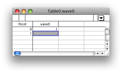
When you start up Igor you will probably see an empty data table, such as shown at the right. If not, or if you need to make a new one, use the menu command or type edit into the command line and press return. (The command line is at the bottom of the window at the bottom of the screen.)
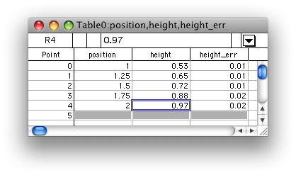
Type a value into the highlighted box of the table. Igor will create a new “wave” called wave0 and enter the value you type into the first element of the wave (which is numbered 0). You should see the following:
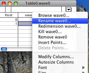
The name wave0 is not very descriptive, so we'll change it to position, since these values will represent positions. Right-click (or control-click on Macintosh) on the name wave0 at the head of the column and select . Enter “position” and press return or click the button.
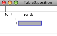
You should now see the following:
Enter the remaining values shown in the table below. Note that you will have to start two new columns and then rename the resulting waves, just as you did before. You may rename them one at a time or both at once, if you enter the values in both columns before renaming them.
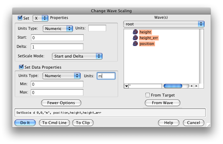
Lastly, each of these values carries units of meters. From the Data menu select . Select all three waves, then type “m” in the lower Units box, as shown in the figure below. You can tell you have things right if the command box at the bottom of the window matches what is displayed in the figure. Then click .
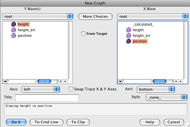
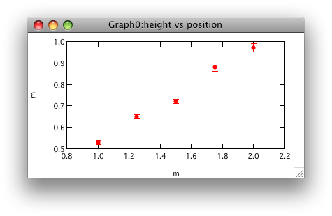
From the Windows menu, select . Select height for the Y wave and position for the X wave, as shown in the figure below. Then click the Do It button.
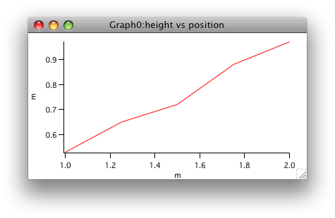
The resulting graph with the default formatting is shown below. Notice that the axes are labeled with the units you assigned for each data series.
We will now modify the trace to show the data with independent symbols instead of a connected line. Either right-click (control-click) on a data point to pop up a contextual menu and select or head to the menu bar and select .
Change the mode to Markers, select the dots from the popup menu to the right of the Size box, then click the Errors Bars... check box.
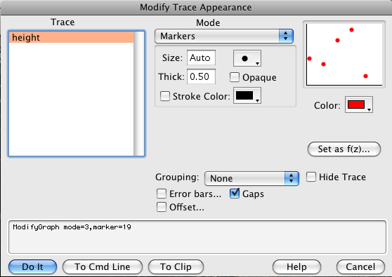
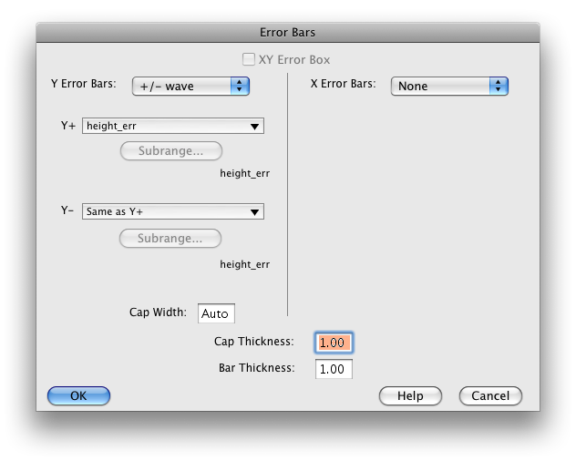
Select +/- wave for the Y Error Bars, and then select height_err from the Y+ menu. Then click OK.
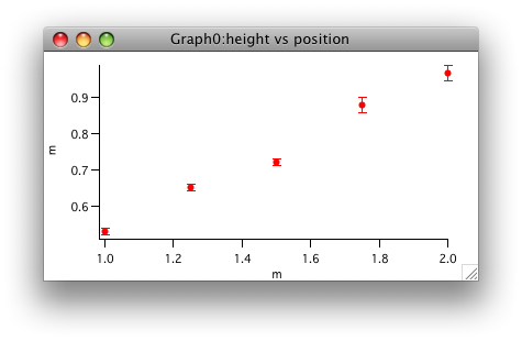
Your graph should now look like this:
Let's now modify the graph a bit to produce mirrored axes and to label each axis. You may also wish to adjust the plot range. Double click on the bottom axis (on the line itself) to bring up a rather complicated dialog box:
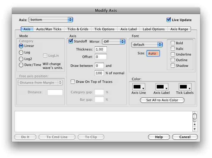
The checkbox means that as you make changes they will be reflected in the graph (if it is not checked, the changes won't appear until you click ). Uncheck the Standoff checkbox, set to On. Then select from the menu at the top left and make the same changes to the left axis.
Click the tab and make the ticks go Inside, and repeat that for the bottom axis. Then click . Your graph should look roughly as follows:
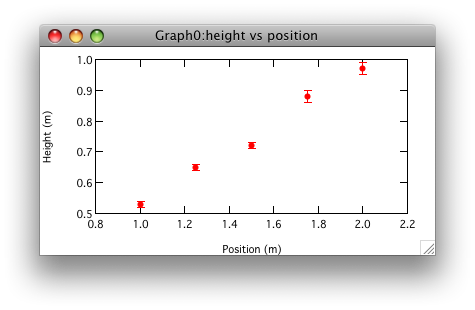
Now bring the dialog up again by double clicking an axis and click the tab. Enter “Position (\U)” for the bottom axis and “Height (\U)” for the vertical axis. The backslash U tells Igor to display the unit. Your graph should now look like the following:
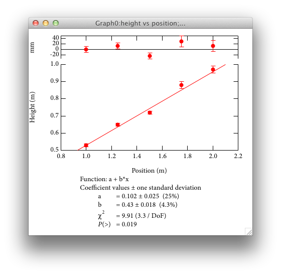
We would now like to fit a straight line to the data, taking into account the uncertainties in the height data. From the Analysis menu, select to bring up another fairly complicated dialog:
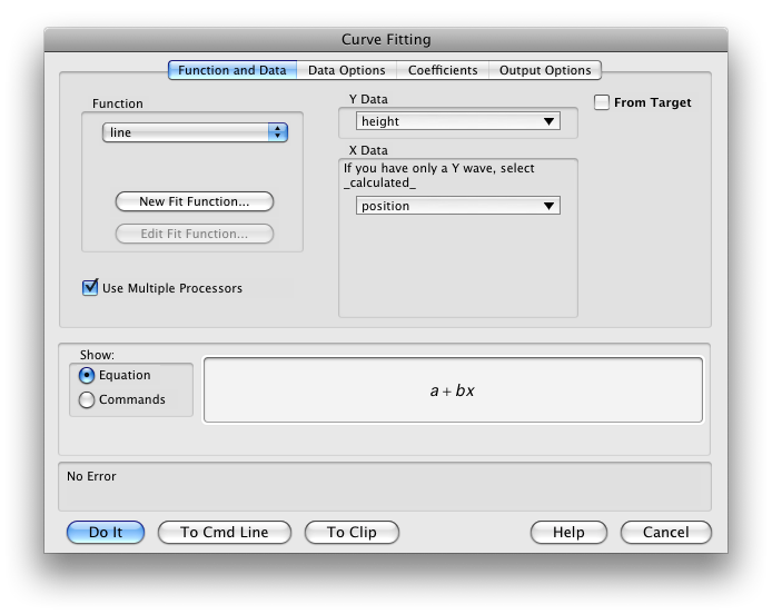
Select height for the Y Data, position for the X Data, and line for the Function. Then click the Data Options tab.
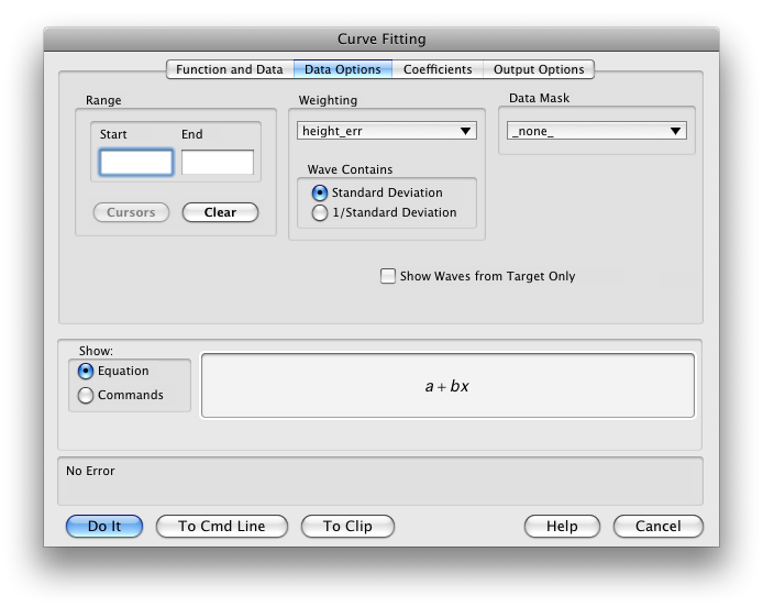
Select height_err for the . Then click the tab.
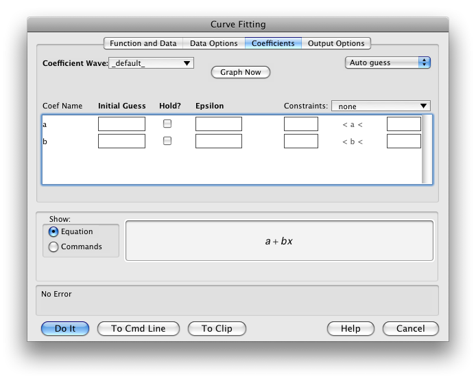
We aren't actually going to change anything on this tab, but when you define your own fitting function in the first tab, you will need to enter initial guesses in this tab. Now click the final tab, .
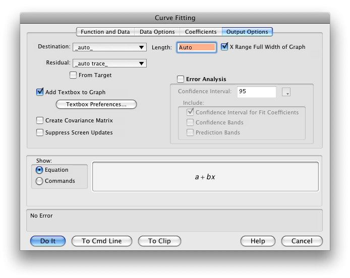
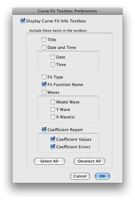
Adjust the menu to _auto trace_, check the and checkboxes, then click the button.
Adjust the settings as shown and click . Then click the button to run the fit. You should now see:
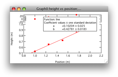
There are a few things to fix up. First, the fit results box is covering up the data. Second, the units for the residual pane need to be dragged out, and we'd like to add a zero line for the residual pane. Finally, it would be nice to display the χ2 information. While it is possible to do all this manually, I have written a script that takes care of this for you. You can find it in the HMC menu as . If there is no HMC menu, you can download and install your own copy of the procedure file.